Doha News
Doha News Brand
Doha News wanted to relaunch after a period of shutdown and a change of ownership. With a history of and strong reputation for hard-news, the new management wanted to expand areas of coverage to include more life-style subjects without losing the existing brand recognition and previous good will and loyalty embedded in the audience.
The logo and palette were updated to meet today’s digital requirements and a crisp and professional no-nonsense design language built around them to present the new and improved Doha News to a potentially sceptical audience.


Web
A new website was developed to present information in as clear and uncluttered way as possible. Referencing the hard-news heritage with clean design and a content-first approach, images were made a priority to provide an eye-catching and welcoming user experience and make space for new, informative types of content.


Social
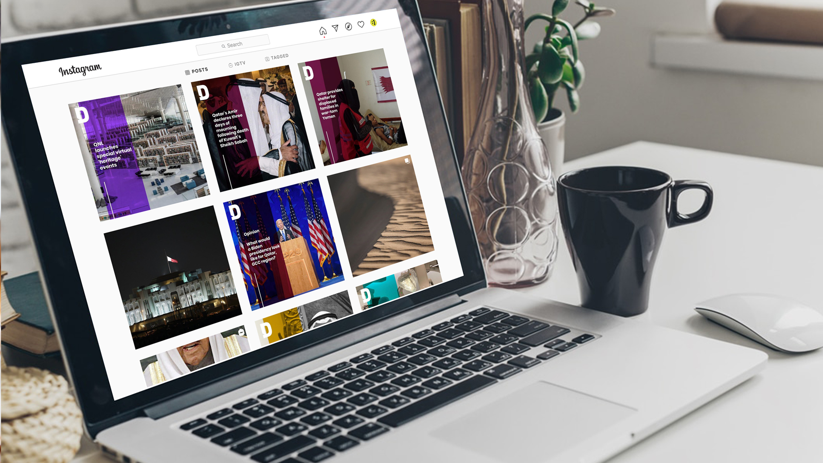
To support the new branding and expand segment appeal a rich, jewel-like colour palette was introduced to compliment the clean design for social templates. It was Applied across social in varying degrees to compliment content types and topics. This, alongside the image -priority strategy, ensured that Doha News posts would stand out in users’ social feeds.


Strands
To support the new branding and expand segment appeal a rich, jewel-like colour palette was introduced to compliment the clean design for social templates. It was Applied across social in varying degrees to compliment content types and topics. This, alongside the image -priority strategy, ensured that Doha News posts would stand out in users’ social feeds.
